2025. 1. 15. 16:21ㆍFullStack Steps/CSS Practicing
<!DOCTYPE html>
<html lang="en">

<head>
    <meta charset="UTF-8">
    <meta name="viewport" content="width=device-width, initial-scale=1.0">
    <title>Document</title>

    <style>
        * {
            margin: 0;
            padding: 0;
        }

        #main-box {
            width: 800px;
            height: 600px;
            margin: auto;
            /* 중앙정렬 */
            background-color: #cccccc;
        }

        #header {
            width: 100%;
            height: 100px;
            background-color: #ff8888;
        }

        #aside {
            width: 30%;
            height: 400px;
            background-color: #ffff88;

            /* 부유속성: 띄우기 */
            float: left;
        }

        #content {

            width: 70%;
            min-height: 400px;
            /* 높이는 자동증가 */
            height: auto;
            background-color: #88ff88;

            float: left;
        }

        .mini-box {
            width: 45%;
            height: 180px;
            border: 1px solid blue;
            margin: 10px;
            box-shadow: 1px 1px 2px black;
        }

        #footer {

            /* 부유속성 해제 */
            clear: both;

            height: 100px;
            background-color: #8888ff;
        }
    </style>
</head>

<body>
    <div id="main-box">
        <div id="header">header</div>
        <div id="aside">aside</div>
        <div id="content">
            <!-- 4 개의 아이템을 넣어줌 -->
            <div class="mini-box">[공지사항]</div>
            <div class="mini-box">[최근게시물]</div>
            <div class="mini-box">[최근댓글]</div>
            <div class="mini-box">[유용한사이트]</div>
        </div>
        <div id="footer">footer</div>
    </div>
</body>

</html>
우리가 보는 모든 웹 페이지는 레이아웃이란게 존재한다
레이아웃은 배치라고 보면 되겠다 무수히 많은 레이아웃들이 존재하지만 우리는 가장 기본적인
header, container, footer 부터 만들어 볼 것이다.
<!DOCTYPE html>
<html lang="en">

<head>
    <meta charset="UTF-8">
    <meta name="viewport" content="width=device-width, initial-scale=1.0">
    <title>Document</title>

    <style>
        #header {
            width: 100%;
            height: 100px;
            border: 1px solid black;
        }

        #content {
            /* 최소 높이는 400px로 고정 */
            min-height: 400px;
            /* 높이는 자동증가 */
            height: auto;
            border: 1px solid black;
        }

        #footer {
            height: 100px;
            border: 1px solid black;
        }
    </style>
</head>

<body>
    <div>
        <div id="header">header</div>
        <div id="content">content</div>
        <div id="footer">footer</div>
    </div>
</body>

</html>
위와 같이 코드를 작성해주고 실행해보면
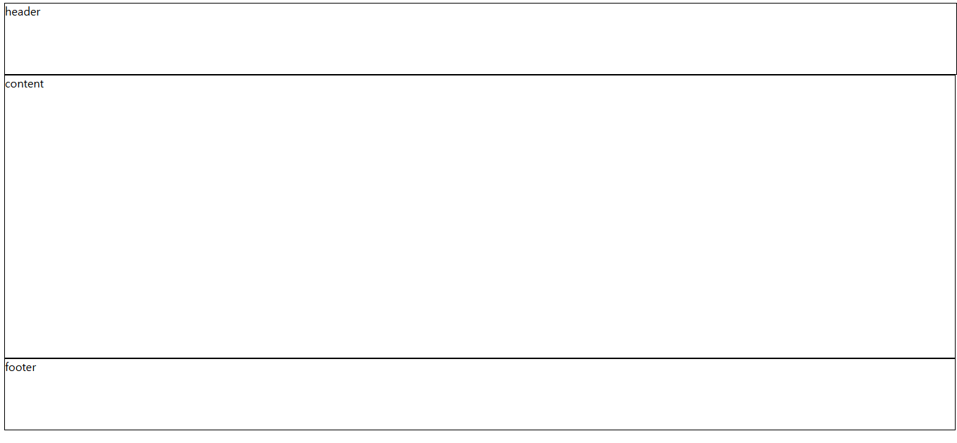
이렇게 나온다. 이것이 가장 기본적인 레이아웃이다.
여기에 색깔만 좀 입혀주고 부담스러운 가로 길이만 조정해주면 훨씬 보기 편할 것 같다
<!DOCTYPE html>
<html lang="en">

<head>
    <meta charset="UTF-8">
    <meta name="viewport" content="width=device-width, initial-scale=1.0">
    <title>Document</title>

    <style>
        * {
            margin: 0;
            padding: 0;
        }

        #main-box {
            width: 800px;
            height: 600px;
            margin: auto;
            /* 중앙정렬 */
            background-color: #cccccc;
        }


        #header {
            width: 100%;
            height: 100px;
            background-color: #ff8888;
        }

        #content {

            min-height: 400px;
            /* 높이는 자동증가 */
            height: auto;
            background-color: #88ff88;
        }

        #footer {
            height: 100px;
            background-color: #8888ff;
        }
    </style>
</head>

<body>
    <div id="main-box">
        <div id="header">header</div>
        <div id="content">content</div>
        <div id="footer">footer</div>
    </div>
</body>

</html>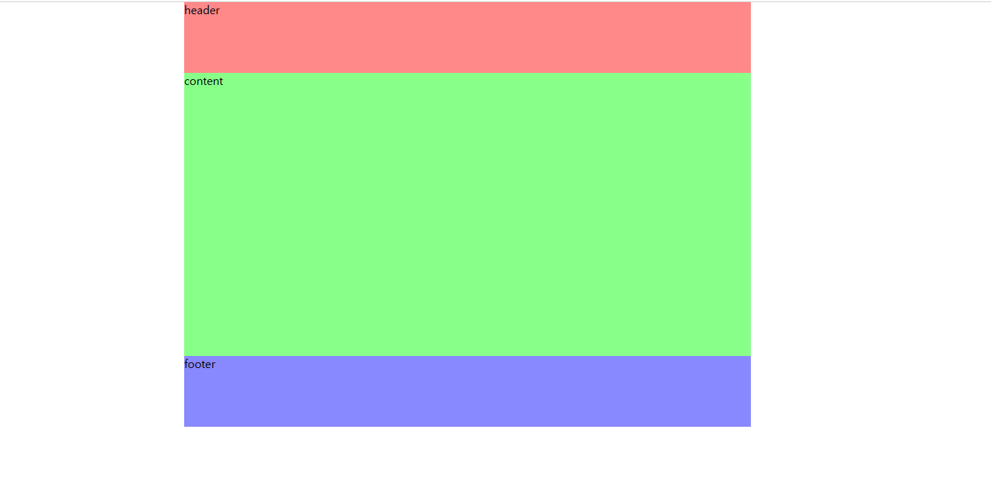
자 지극히 개인적인 훨씬 깔끔하고 보기 편한 레이아웃을 만들어 보았다.
만약 content 자리에 수평으로 사이드 바나 다른 컨테이너를 넣고 싶다면 어떻게 해야할까?
두 번째 레이아웃을 만들어보자
먼저 간단하게 창만 추가하면 어떻게 될까?
<!DOCTYPE html>
<html lang="en">

<head>
    <meta charset="UTF-8">
    <meta name="viewport" content="width=device-width, initial-scale=1.0">
    <title>Document</title>

    <style>
        * {
            margin: 0;
            padding: 0;
        }

        #main-box {
            width: 800px;
            height: 600px;
            margin: auto;
            /* 중앙정렬 */
            background-color: #cccccc;
        }

        #header {
            width: 100%;
            height: 100px;
            background-color: #ff8888;
        }

        #content {

            min-height: 400px;
            /* 높이는 자동증가 */
            height: auto;
            background-color: #88ff88;
        }

        #footer {
            height: 100px;
            background-color: #8888ff;
        }
    </style>
</head>

<body>
    <div id="main-box">
        <div id="header">header</div>
        <!-- 여기에 aside 창을 하나 만들어주었다 -->
        <div id="aside">aside</div>
        <div id="content">content</div>
        <div id="footer">footer</div>
    </div>
</body>

</html>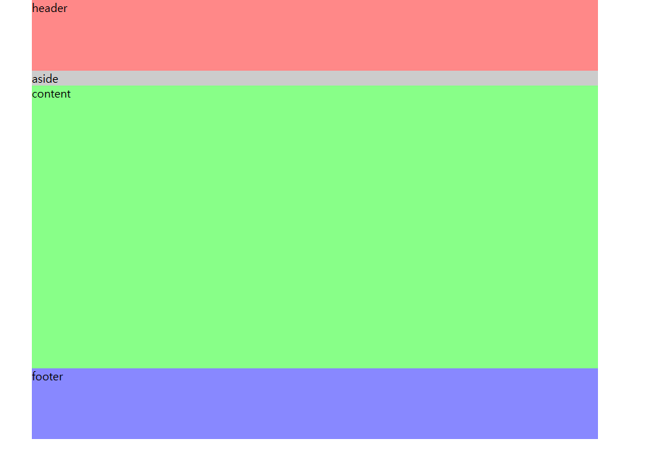
역시 실행결과는 이렇게 나왔다. 그렇다면 어떻게 aside랑 content를 수평으로 나란히 놓을 수 있을까?
여러 방법이 있을 수 있지만 필자는 float 속성을 쓰려고 한다. float은 둥둥 떠다니다는 뜻을 가지고 있듯이
CSS를 통해 콘텐츠를 띄워주면 된다. 그리고 두 칸의 크기를 합쳐서 부모 길이의 100%로만 맞춰주면 된다.
백문이 불여일견! 말로만 보면 무슨 소리인지 모르니 직접 코드를 작성해보자
<!DOCTYPE html>
<html lang="en">

<head>
    <meta charset="UTF-8">
    <meta name="viewport" content="width=device-width, initial-scale=1.0">
    <title>Document</title>

    <style>
        * {
            margin: 0;
            padding: 0;
        }

        #main-box {
            width: 800px;
            height: 600px;
            margin: auto;
            /* 중앙정렬 */
            background-color: #cccccc;
        }

        #header {
            width: 100%;
            height: 100px;
            background-color: #ff8888;
        }

        #aside {
            /* 너비를 부모(main-box)의 30% 주기 */
            width: 30%;
            height: 400px;
            background-color: #ffff88;

            /* 부유속성: 왼쪽으로 띄우기 */
            float: left;
        }

        #content {
            /* 너비를 부모(main-box)의 70% 주기 */
            width: 70%;
            min-height: 400px;
            /* 높이는 자동증가 */
            height: auto;
            background-color: #88ff88;

            /* 부유속성: 왼쪽으로 띄우기 */
            float: left;
        }

        #footer {
            height: 100px;
            background-color: #8888ff;
        }
    </style>
</head>

<body>
    <div id="main-box">
        <div id="header">header</div>
        <!-- 여기에 aside 창을 하나 만들어주었다 -->
        <div id="aside">aside</div>
        <div id="content">content</div>
        <div id="footer">footer</div>
    </div>
</body>

</html>
자 실행결과를 한 번 보자
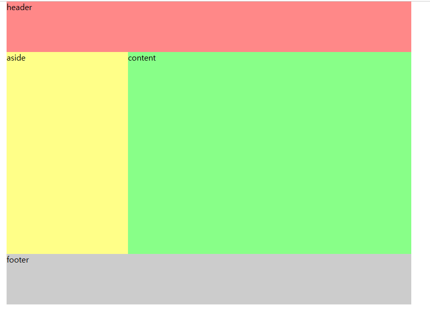
오 잘 붙었다!!
근데 이상한 점이 하나 있다. 눈치 챘는가?
바로 footer의 색깔이 main-box의 색깔로 바뀐 것이다.
이유는 aside와 content를 위로 띄웠기 때문에 footer가 위로 올라가 버린 것이다.
자 내리는 방법은 간단하다 float 속성을 적용한 바로 다음에 위치하는 컨텐츠의 CSS에 clear 속성을 걸어주면 된다.
코드를 한 번 보자!
<!DOCTYPE html>
<html lang="en">

<head>
    <meta charset="UTF-8">
    <meta name="viewport" content="width=device-width, initial-scale=1.0">
    <title>Document</title>

    <style>
        * {
            margin: 0;
            padding: 0;
        }

        #main-box {
            width: 800px;
            height: 600px;
            margin: auto;
            /* 중앙정렬 */
            background-color: #cccccc;
        }

        #header {
            width: 100%;
            height: 100px;
            background-color: #ff8888;
        }

        #aside {
            /* 너비를 부모(main-box)의 30% 주기 */
            width: 30%;
            height: 400px;
            background-color: #ffff88;

            /* 부유속성: 왼쪽으로 띄우기 */
            float: left;
        }

        #content {
            /* 너비를 부모(main-box)의 70% 주기 */
            width: 70%;
            min-height: 400px;
            /* 높이는 자동증가 */
            height: auto;
            background-color: #88ff88;

            /* 부유속성: 왼쪽으로 띄우기 */
            float: left;
        }

        #footer {
            /* 부유 속성 해제 */
            clear: both;
            height: 100px;
            background-color: #8888ff;
        }
    </style>
</head>

<body>
    <div id="main-box">
        <div id="header">header</div>
        <!-- 여기에 aside 창을 하나 만들어주었다 -->
        <div id="aside">aside</div>
        <div id="content">content</div>
        <div id="footer">footer</div>
    </div>
</body>

</html>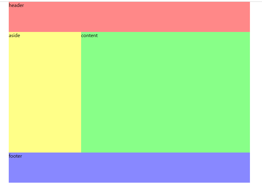
짜잔~ 정상적으로 footer가 제자리를 찾아갔다.
이번 시간은 이렇게 간단하게 레이아웃을 만들어 봤는데
다음 시간엔 이 float 속성을 활용해서 content에 4 개의 창을 띄워 보는 작업을 하겠다.
'FullStack Steps > CSS Practicing' 카테고리의 다른 글
| CSS 레이아웃 만들기 2 (0) | 2025.01.17 |
|---|---|
| CSS 수평메뉴 수직메뉴 간단하게 만들어 보기 (0) | 2025.01.07 |
| CSS 선택자(Selector)의 요소 정리 (0) | 2025.01.02 |
| CSS(Cascading Style Sheets)란? (1) | 2024.12.23 |